BRAND GUIDELINES
OUR LOGO
Download ORNL FCU Logos (.zip)
For maximum flexibility with the ORNL FCU brand there are two logo lockups to choose from:
PRIMARY
The primary mark is used most often.
![]()
ICON
The icon may be used in-branch, on internal documents, when space is limited, and when supporting copy that includes the words “ORNL Federal Credit Union”.
![]()
CLEAR SPACE
Always surround the ORNL logo with the amount of clear space shown to ensure that the logo is easily identifiable as well as visible and legible wherever it appears.
![]()
![]()
COLOR
Brands and color are inextricably linked because color offers an instantaneous method for conveying meaning and message without words.
Color is the visual component people remember most about a brand followed closely by shapes/symbols then numbers and finally words.
The ORNL logo and colors are a vital part of its visual identity and should always be respected and used as outlined here.
NOTE: The ORNL logo should only be used over solid brand colors, never over a photo.
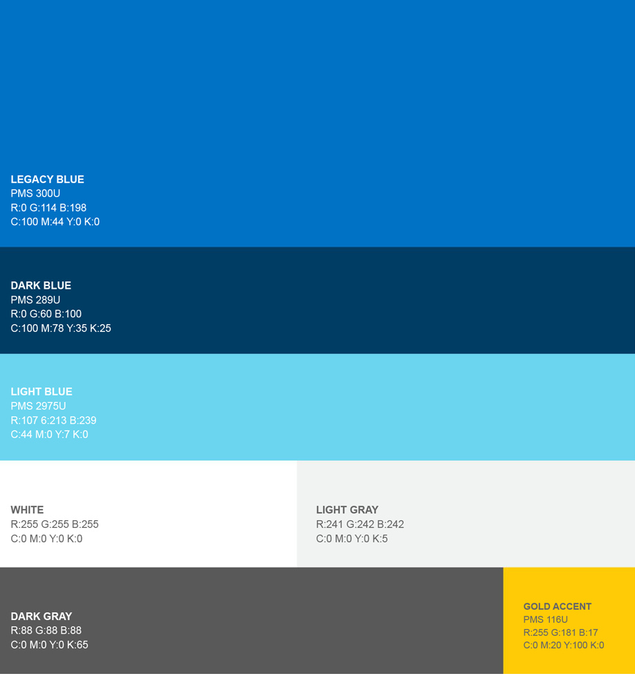
OUR COLORS
Our primary palette includes three shades of blue. Legacy Blue is our brand's bright, mid-range color. It pairs beautifully with our Dark Blue as well as our fresh and friendly Light Blue. These three blues give ORNL flexibility in terms of contrast and feel, while maintaining ownership of blue.
NOTE: In applications where we are limited to one color, Legacy Blue takes priority.
Gold is the ideal accent, used exclusively for CTAs, which creates a visual language that is easy to follow.
NOTE: Gold should never be used on top of Light Blue due to lack of contrast.
White and gray neutrals provide brightness and depth.
NOTE: White, dark gray, and dark blue are best for body copy.